



Your Power Platform Trainer: J. H. Irwin
Author | Content Creator | Technology Strategist
At some point in the last few weeks, someone probably asked you how the requests were going.
If you have been following along, you built the Team Requests tracker in Module 2 and gave it flows in Module 3, so you almost certainly said “fine” or “busy” and meant it. But I would bet you did not actually know. Not how many came in last week compared to the week before, not which category quietly doubled, not whether the person you think is overloaded actually is. The data to answer every one of those questions has been accumulating in your Dataverse table since the day you built the app. It has just been sitting there in rows, and rows are a terrible way to see anything.
That is the whole of this module. Your system has hands and a heartbeat. Now we give it sight. By the end you will have a one-page Power BI report, built on the same Team Requests table, that answers the questions you have been guessing at, and you will have published it where your team can see it. Along the way I will show you the two or three ideas that separate people who make charts from people who understand their data, because the tool is the easy part.
What Power BI Actually Is
People tend to arrive at Power BI thinking it is Excel with nicer charts, and it is worth spending a paragraph dismantling that, because the misunderstanding causes most early frustration.
Excel is a grid where data and calculations live together on the same sheet, and you can type anything anywhere. Power BI separates three things that Excel blurs. First there is a model, a clean, structured copy of your data with defined columns, relationships between tables, and calculations that live in one place. Second there are reports, the visual pages built on top of that model. Third there is the service, the cloud home where reports are published, refreshed, and shared. The discipline of keeping those separate is exactly why a Power BI report can be handed to three hundred people and still be right, while a shared spreadsheet becomes a rumor after its third recipient.
There are two pieces of software. Power BI Desktop is a free Windows application where you connect to data, shape it, and build reports. This is where authors work. The Power BI service at app.powerbi.com is where finished reports go to be seen, and it is where the licensing lives, which we will get to plainly at the end. For today, the pattern is simple: build in Desktop, publish to the service, share from there.
One more piece of vocabulary. A report is one or more pages of visuals that all sit on a single model and filter each other. A dashboard in Power BI is a specific thing, a single pinned-together summary page that can combine tiles from several reports, and it is not what you build first. When people say “build me a dashboard,” nine times out of ten they mean a report page, and that is what we are making.
Getting Your Data Into Desktop
Install Power BI Desktop from the Microsoft Store or from Microsoft’s site; it is free and there is no trial clock on it. Open it, sign in with the same account you used for your developer environment, and you are ready.
Choose Get data and look for Dataverse in the list. Sign in if prompted, and you will see your environments. Pick the developer environment where your Team Requests app lives, then expand it and tick your Team Requests table. Before you click Load, glance at the two connection options Desktop offers. Import copies the data into your report file, which makes everything fast and lets you shape it freely, at the cost of the data being a snapshot until it is refreshed. DirectQuery leaves the data in Dataverse and asks for it live, which sounds better and almost never is for a table this size, because every click becomes a round trip. Choose Import. I will show you how to keep it fresh later.
Now, instead of loading straight away, click Transform data. This opens Power Query, the shaping room, and it is the most underrated part of the whole product. The Team Requests table will arrive with far more columns than you created, because Dataverse quietly adds system columns for ownership, versioning, and audit. Remove everything you do not recognize; you can always add a column back. Rename anything awkward so that the labels a colleague sees on a chart are the words your team actually uses. Check that your date columns show a calendar icon and your priority and status columns show text, because a date that Power BI thinks is text will refuse to make a timeline.
While you are here, add the one column that will make this report worth building. Select the Completed On date column and the Created On date column, or whatever you named them in Module 2, and use Add Column to subtract one from the other. Name the result Days to Complete. Every step you take in Power Query is recorded in a list on the right, and it will be replayed automatically on every refresh from now on. You are not editing data. You are writing a recipe, and this is the moment most people realize Power BI is nothing like a spreadsheet.
Click Close & Apply and your model is ready.
One Measure, Then We Build
Power BI has its own formula language called DAX. It is powerful, it is deep, and you do not need almost any of it today, so I am going to give you exactly one measure, both because you will use it and because writing one demystifies the rest.
In the Data or Model view, right-click your table and choose New measure, and type:
Open Requests = CALCULATE(COUNTROWS('Team Requests'), 'Team Requests'[Status] = "Open")
Read it aloud and it says what it does: count the rows, but only where Status is Open. The word CALCULATE is doing the filtering, and that one pattern, count something under a condition, is the foundation of most reporting DAX you will ever meet. If your status values differ, change the word in quotes and nothing else. A measure is a calculation that responds to whatever is on the page. Put it beside a chart of categories and it becomes open requests per category without you writing anything more. That responsiveness is the thing to fall in love with.
Building the Page
Switch to the Report view. You have a blank canvas, a Visualizations pane of chart types, and a Data pane listing your columns and your new measure. Building a visual is a matter of choosing a chart type and dragging fields into its wells. Here is the page I would build, in the order I would build it, with the question each visual exists to answer. Notice that every visual starts with a question. A chart without a question is decoration.
How much is open right now? Add a Card visual and drop your Open Requests measure onto it. One big number. Resize it and put it top left, because it is the first thing anyone will look for.
Are requests speeding up or slowing down? Add a Clustered column chart, put Created On on the x-axis, and drag any column, the request title will do, into the y-axis well, then change its aggregation to Count. Power BI will offer you a date hierarchy of year, quarter, month, and day; use the chart’s drill controls to settle on Month or, if your table is young, Day. This single chart answers the question your boss actually asked.
Where is the work coming from? Add a Bar chart with Category on the y-axis and a count on the x-axis. Sort it descending so the biggest bar is on top. Now do the same again with Assigned To, and lay the two side by side. You have just made visible the two things everyone argues about in meetings: what kind of work dominates, and who is carrying it.
How long does it take? Add another Card with Days to Complete and set its aggregation to Average. Then, because averages lie, add a Table visual with Title, Assigned To, Due Date, and Status, and use the visual’s Filters pane to show only rows where Status is Open and Due Date is before today. Title it Overdue. This is the visual that will get the report opened every morning.
Let people ask their own question. Add a Slicer with Priority in it. A slicer is a filter the reader controls, and it turns your page from a statement into a conversation.
Now do the thing that makes Power BI feel like magic the first time. Click a bar in the Category chart. Every other visual on the page instantly filters to that category: the open count changes, the trend re-draws, the overdue table shrinks to that category’s stragglers. Click it again to release. This is cross-filtering, and it is on by default between every visual on a page that shares a model. You did not configure it. You built one model, and the model does the work.
Give the page a title, tidy the alignment, and save the file. That is a report. It took perhaps forty minutes, and it answers more about your requests than you have ever known.
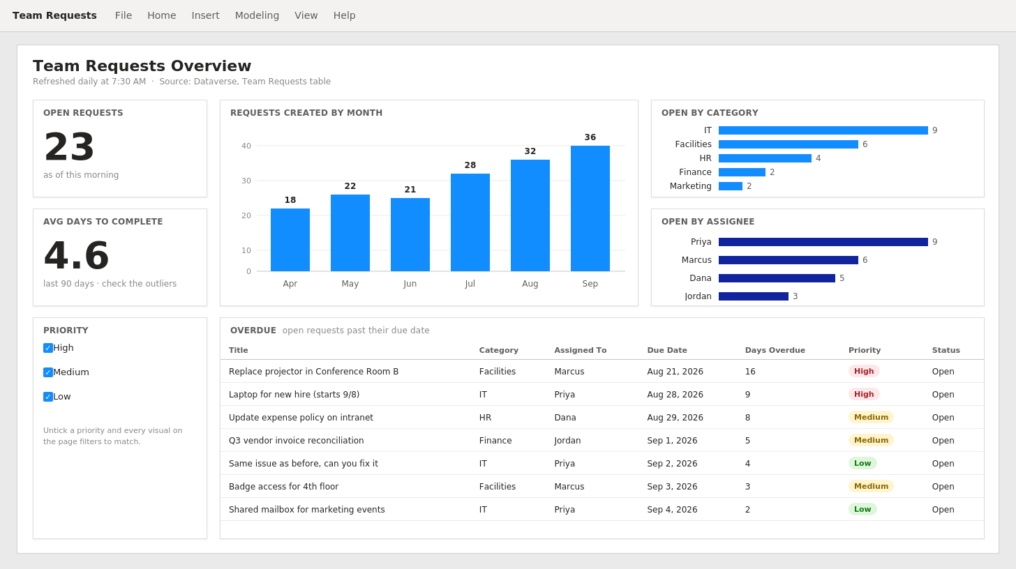
Your Finished Report Page
Publishing, Sharing, and Keeping It Fresh
Click Publish in Desktop, choose a workspace in the service, and Desktop uploads two things: your model and your report. Open the service in a browser and you will find both. Your team does not need Desktop to see the report; they need a browser, or the Power BI app on their phone, or, best of all, Teams.
Sharing from the service takes several forms, and the right one for a small team is the simplest. Open the report and add it as a tab in the Teams channel your Module 3 flows already post into, so the notification, the nudge, and the picture of the whole queue live in one place. If you want it inside the app itself, the Power BI tile in Power Apps embeds a report page directly onto a screen, which for the Team Requests app means a manager can see the overview and open a request from the same place. Both feel like a small thing. Both are the reason people keep using what you built.
Because you chose Import, the report is a snapshot of the moment you last refreshed it. In the service, open the model’s settings and turn on Scheduled refresh. Dataverse is a cloud source, so there is no gateway to install and no server to fuss over; you set the times, and the recipe you wrote in Power Query is replayed against live data. Once a day is plenty for a request queue. If your team wants to see the morning’s arrivals, schedule it for just before the nudge flow runs, so the two tell the same story.
Three Things That Will Make You Better Than Most
The tool is learned. Now the craft, which is where I would rather spend the last of your attention.
Decide the question before you touch the chart. The most common failure in reporting is not a wrong chart; it is a page of twelve visuals nobody asked for, each accurate and none useful. Every visual you added today began as a plain-English question, and I would hold yourself to that forever. If you cannot say what question a visual answers, remove it. A page with four honest visuals beats a page with fourteen every time, and it loads faster besides.
Distrust your own averages. The average days-to-complete card on your page is probably wrong in an interesting way. One request that sat for ninety days will drag the average of a hundred three-day requests to nearly four, and your team will feel accused of something they did not do. Averages are a starting point. The overdue table beside it is the truth. When a number surprises you, the right instinct is not to report it, it is to click on it and find the rows underneath. Power BI makes that one click. Use it.
Model once, report many. You will be tempted, next month, to build a second report by starting from scratch. Do not. Publish the model once, and build new reports on it from the service or from Desktop using the existing model as the source. When you later fix the way Days to Complete is calculated, every report on that model is fixed at once. This is the discipline that separates reporting people trust from reporting people argue with, and it is far easier to adopt now, with one table, than later, with thirty.
The Licensing Conversation, Straight
As with every module, here are the numbers as of early September 2026, and, as with every module, Microsoft changes them, so confirm on their pricing page before anyone budgets from an article.
Everything you did in Desktop was free and will stay free. You can learn an enormous amount, build real reports, and never spend a cent. The cost begins the moment a report leaves your machine to be seen by someone else.
Power BI Pro is $14 per user per month, and it is included in Microsoft 365 E5. Here is the rule that trips up every organization once: Pro is required for the person who publishes and for every person who views a shared report. Viewers are not free at this tier. Your free account can publish to a personal workspace, which is fine for practice, but sharing with your team means Pro for the team.
Premium Per User is $24 per user per month and adds larger models, more frequent refreshes, and advanced features. As with Pro, everyone who views a report that uses those features needs the same license.
Microsoft Fabric capacity is the enterprise path: the organization buys a pool of compute rather than licensing seats, starting around $263 per month for the smallest F2 tier. The number that matters in that ladder is F64, at several thousand dollars a month, because that is the level at which report viewers no longer need a paid license at all. For a small team, per-user Pro is far cheaper. For an organization with a few hundred viewers, capacity wins. Somewhere in between, somebody does the arithmetic, and it is worth knowing that the arithmetic exists so you are not surprised by which side of it you land on. Microsoft offers a Fabric trial if you want to see the capacity experience without a purchase.
One tie back to earlier modules. The report you built reads from Dataverse, and Dataverse is a premium connector in Power Apps and Power Automate terms. Power BI licensing is its own world and does not care about that, but the app your report reads from still does. Nothing about today changes the licensing conversation you had in Module 3. It just adds a second, separate one.
Your Homework, and What Comes Next
You know the shape by now. Go back to your own app, the one you built in Module 2 to fix a small, real irritation in your work and then gave a flow to in Module 3, and build it one report page. Four visuals, each with a question you can say out loud, one slicer, and an overdue table or its equivalent. Publish it, pin it in Teams next to your flow’s notifications, and then, this is the part that matters, look at it every morning for a week. Not to admire it. To notice what it tells you that you did not already know. Somewhere in that week a number will surprise you, and you will click on it, and that is the moment you become someone who understands their data rather than someone who has a chart.
Your system now has hands, a heartbeat, and sight. It collects work, moves it, and shows you the truth about it. What it does not yet have is judgment. In the next module we bring in Copilot Studio and build something that can read a new request, decide what it is, check whether it is a duplicate, and suggest where it should go, before anyone on your team has opened it. That is the piece the whole industry is shouting about this year, and I want to show you what is real underneath the noise. Bring the app, the flows, and this report. The agent is going to use all three.
Technology is changing the world. Read about it → The Augmented Life